That Card Churches Make You Fill Out
When you go to almost any protestant church in America, you're probably prompted to fill out a first-time visitor's card.
The "Connect Card," the "Communication Card," the "Connection Card," the "Red Card", the "I'm New" card, the "Welcome Card"... it goes by many names. But the point is to have a way for new people to tell the church, "Hello, I visited you, and I would like to know/connect/request ________"
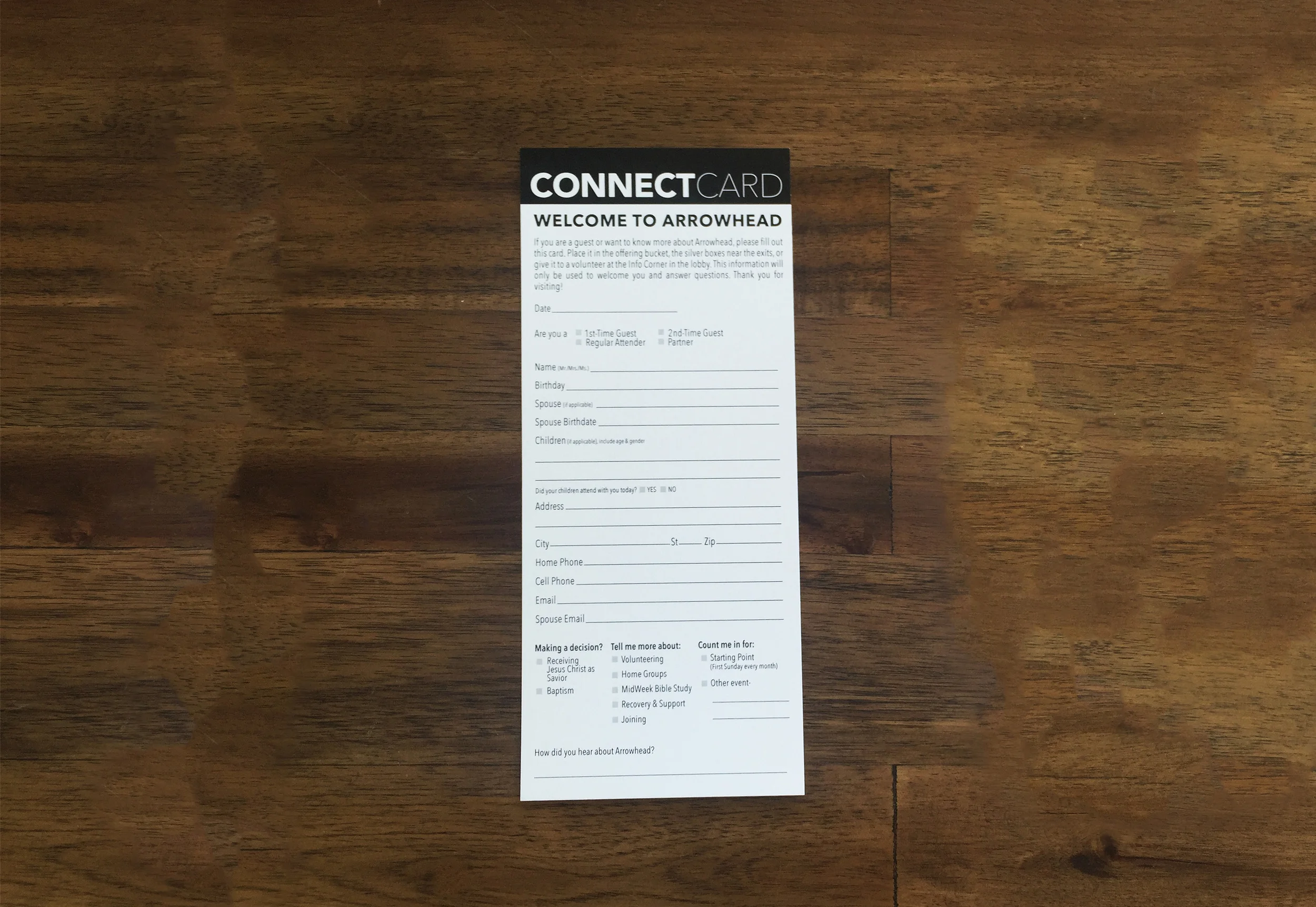
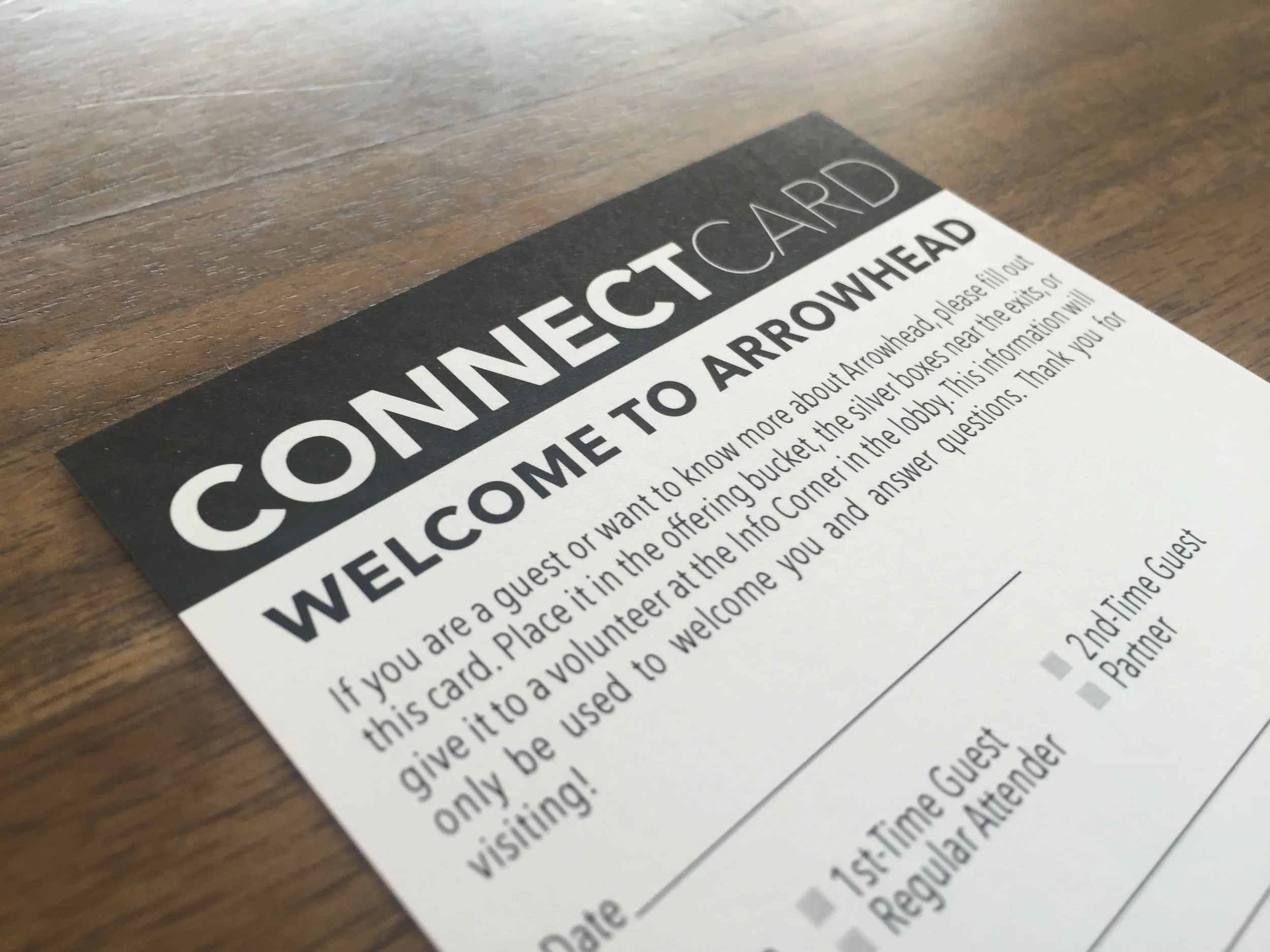
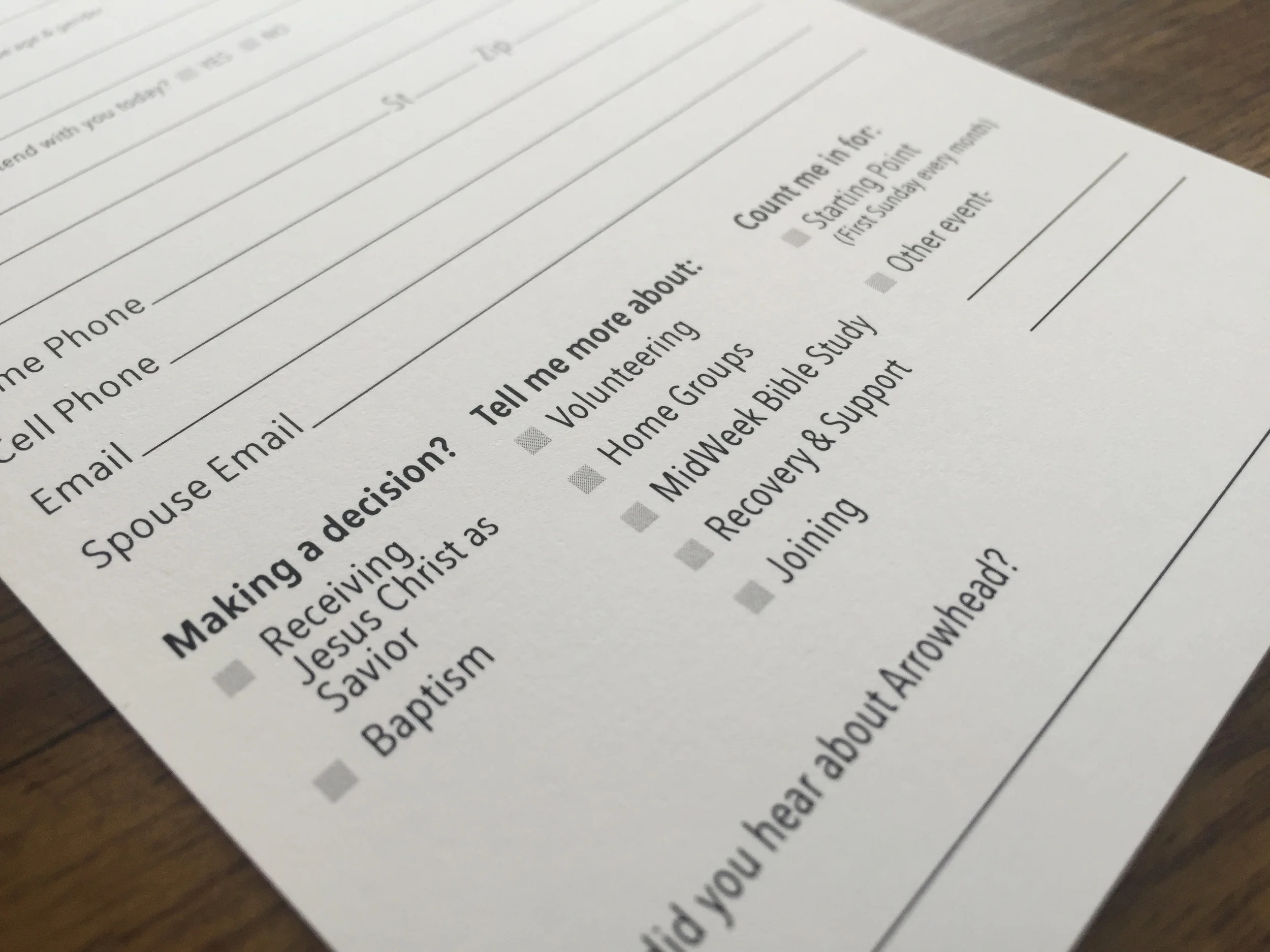
At Arrowhead, we've had this card for a long time, and we call our's the "Connect Card". We made it several years ago, based on another church's, and it looked like this.
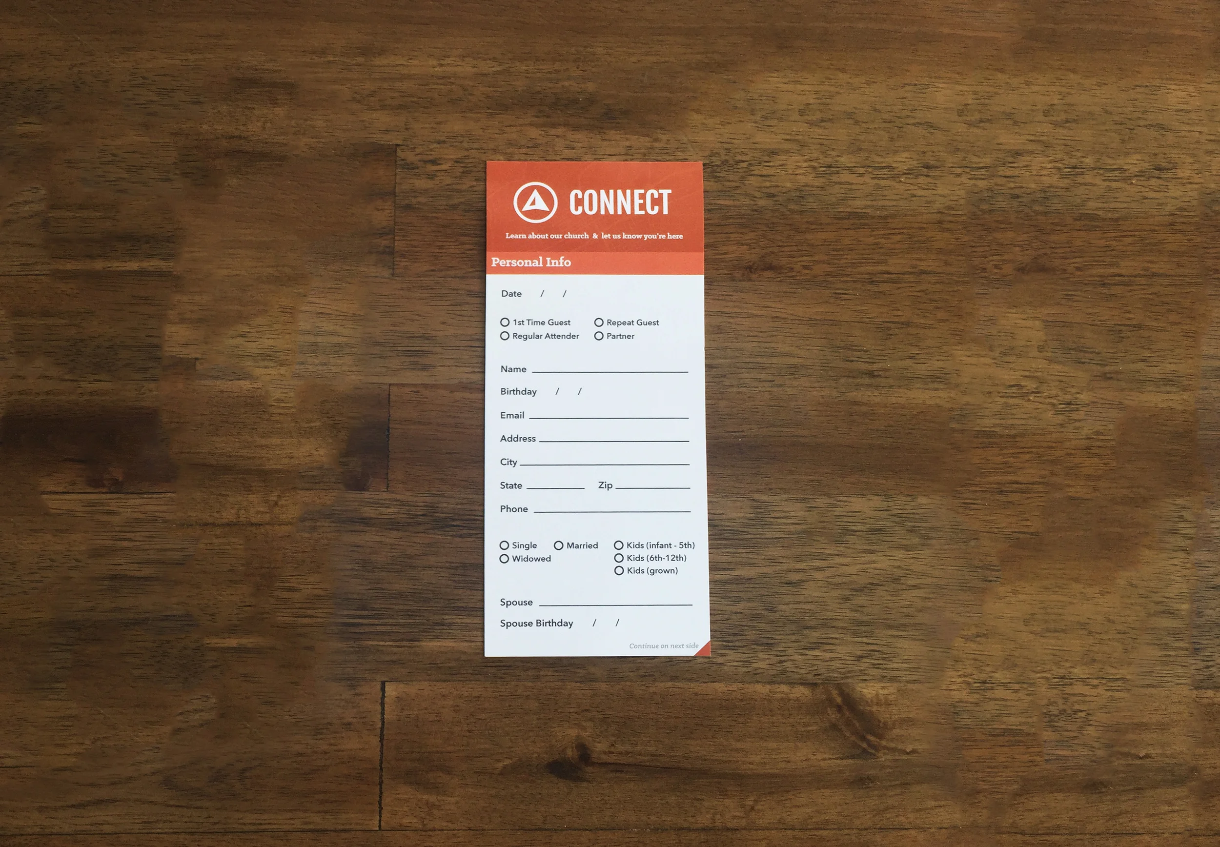
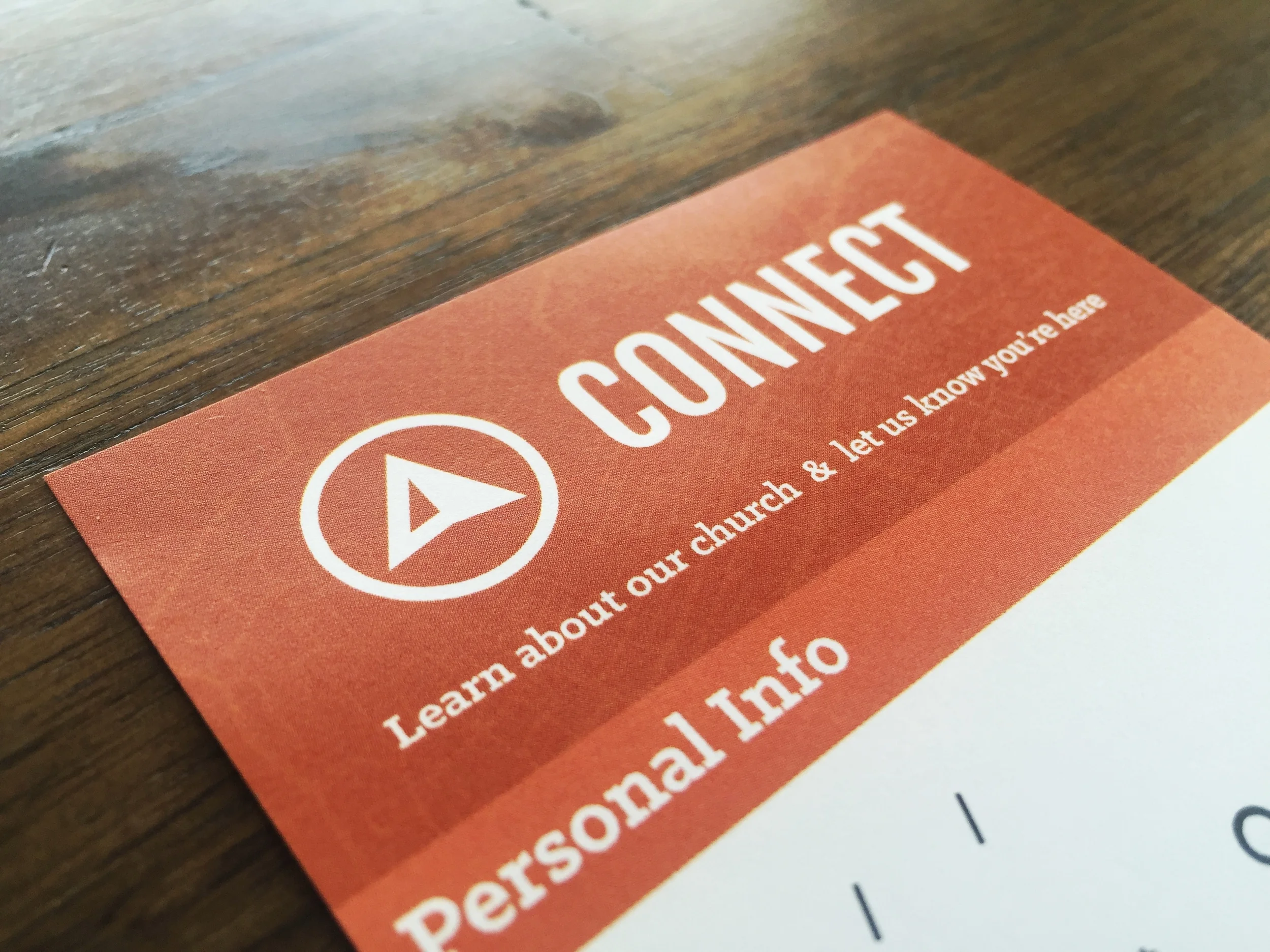
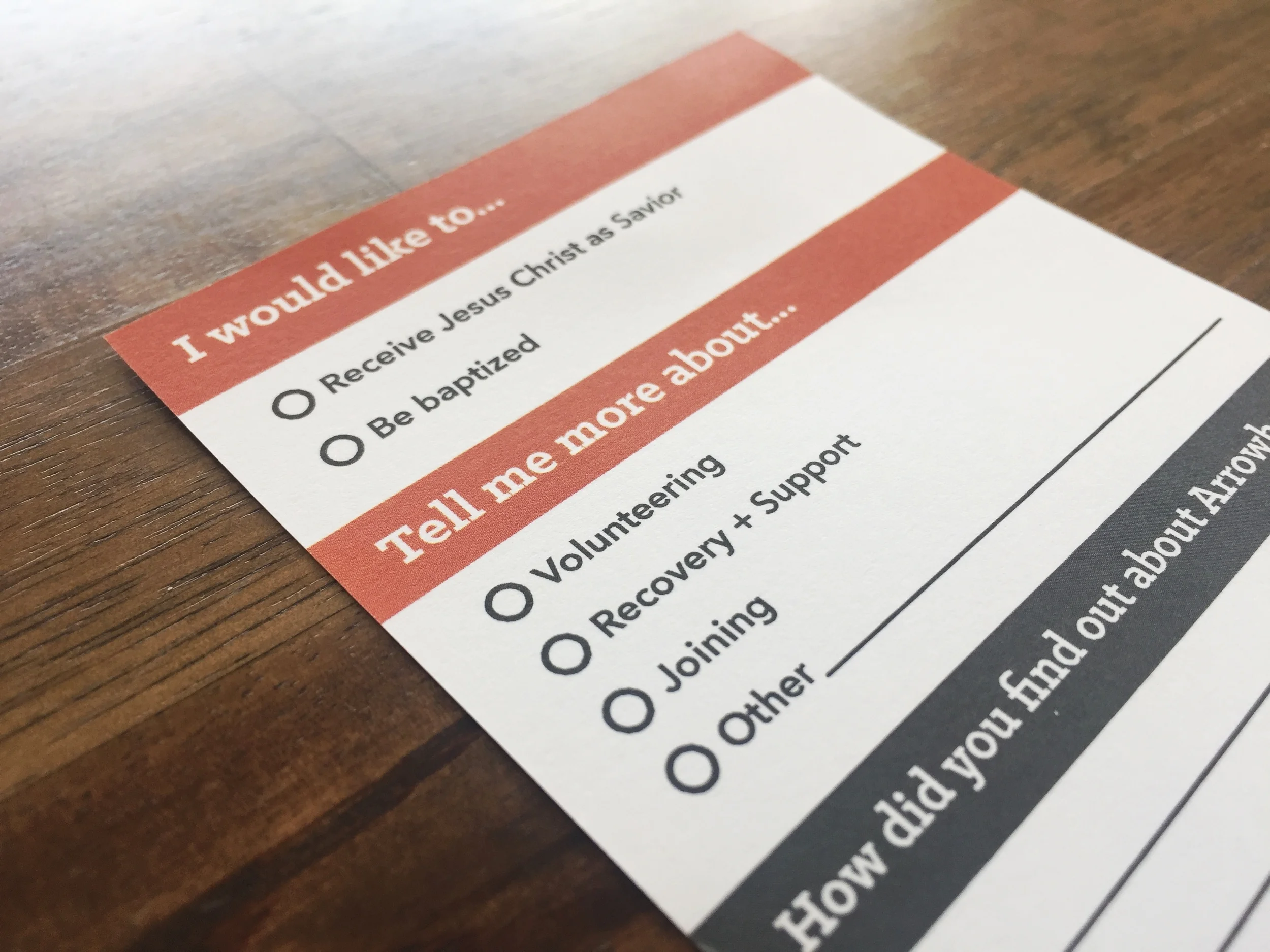
In the last month, I redesigned it to look like this.
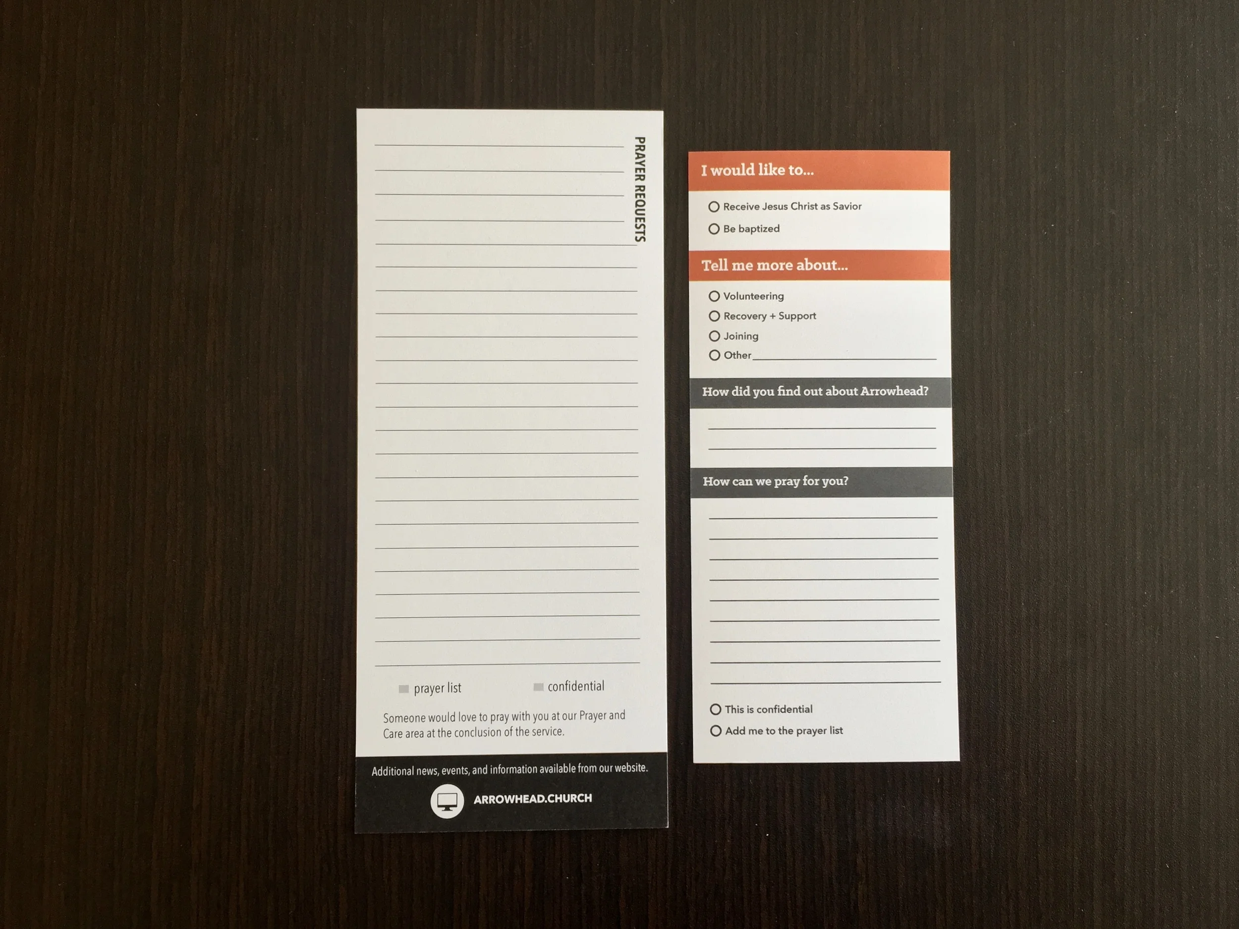
It's smaller, it's in color, styled to our aesthetic, and removes the portions of the Connect Card that are unnecessary. Below, you can see the comparisons (click to enlarge).
It's about the feeling a visitor gets in their split-second first impression. Most of this change is purely aesthetic, but whereas the old card focused on getting the information, my approach was to get the feeling right. We don't want people to feel like they have paperwork to do when they come to church.
The biggest change is the fact that our church leadership is moving from a process-based connection strategy to a relationship-based strategy, and that change is visible perhaps no where better than this card. We no longer needed a million options on this card to put people where they "need to be." That's a huge change.
Other major changes I made were:
- New header
- Eliminate the paragraph description. Instead, we can use a single statement to provide instructions for this card
- Change "Connect Card" to just "Connect" (so it's the "Connect" card)
- New fonts
- Klinic Slab for section headings to be informal
- Avenir Next for body to be easy to read, well spaced out, and friendly
- Much more whitespace
- Easier to read
- Feels easy to fill out
- Circles for selection options instead of square boxes
- More fun and less formal
- Section dividers to organize the form
- Structure is good!
- What may have previously felt like an endless form now provides a clear beginning and end
It's a small project, and certainly overlooked, but this card is by far our most important and most used piece of graphic design at Arrowhead. It's a design that will evolve as we learn how to better track new visitors and connect them to ministries where they will grow. Hopefully these changes will help make the card feel less like an obligation and more like a helpful option.

