By Design - Series Promo
Production Tools
Creative Process
The idea behind this video was simple: The audience hears common thoughts/expectations of men and women while the design of the stick figures is drawn. Our creative intern, Kaitlin Andrews, wrote the script - influenced by a voiceover previously done for a relationship series by The Village Church.
At this point, my friends know that if they walk in my office, there's about a 50% chance I'm going to ask them to participate in whatever creative project I'm working on at the time. Such was the case last week, when my friends graciously provided their voices for this video. And they really got into it (they're the best)!
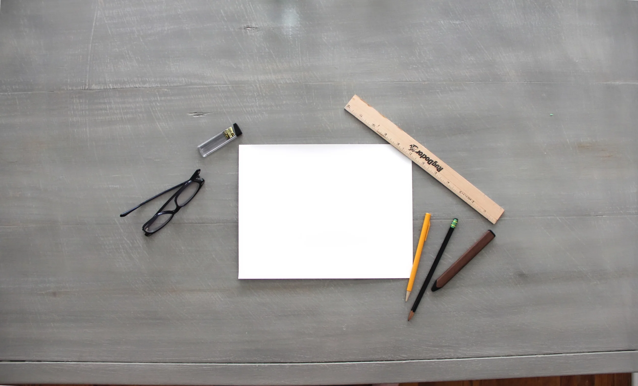
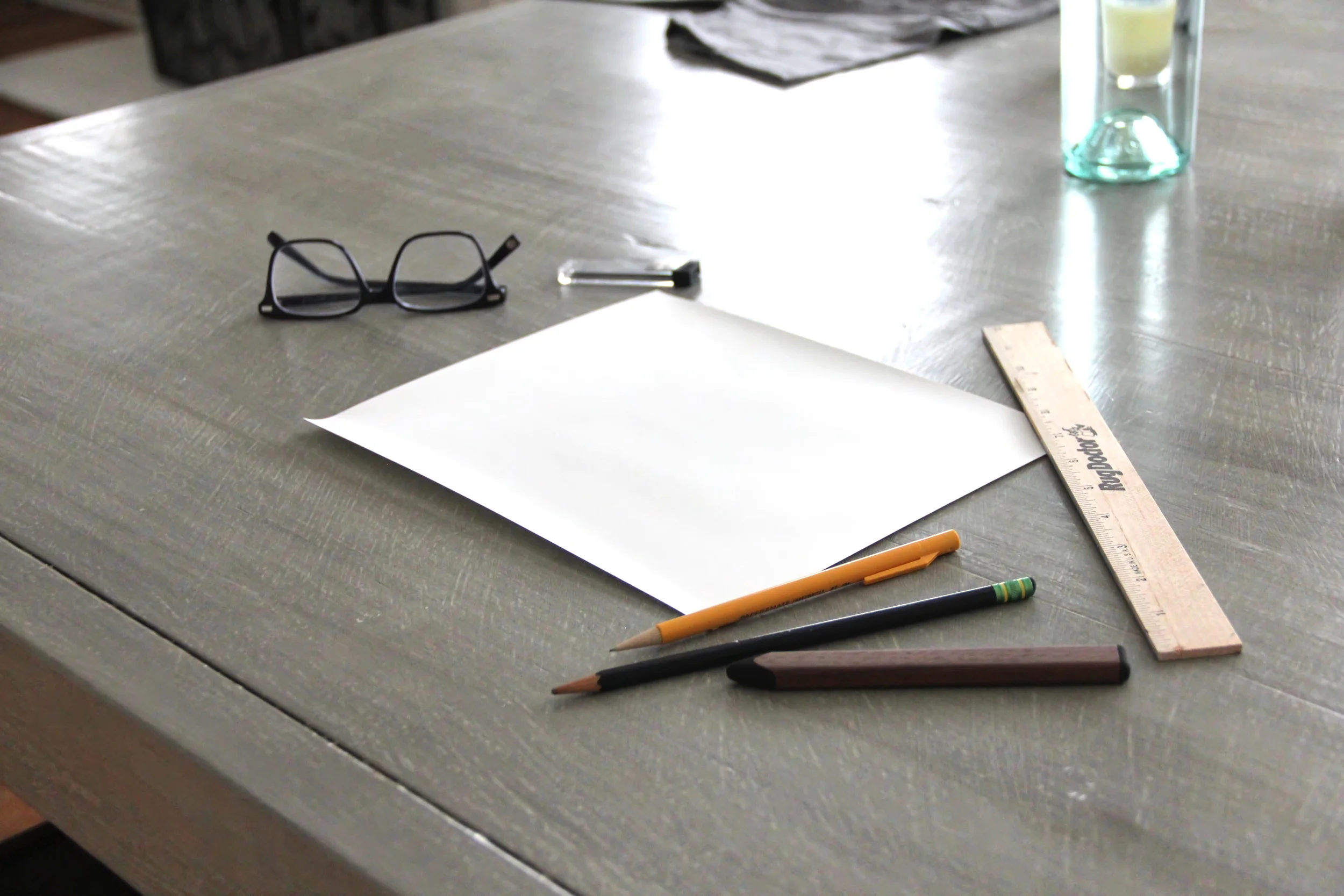
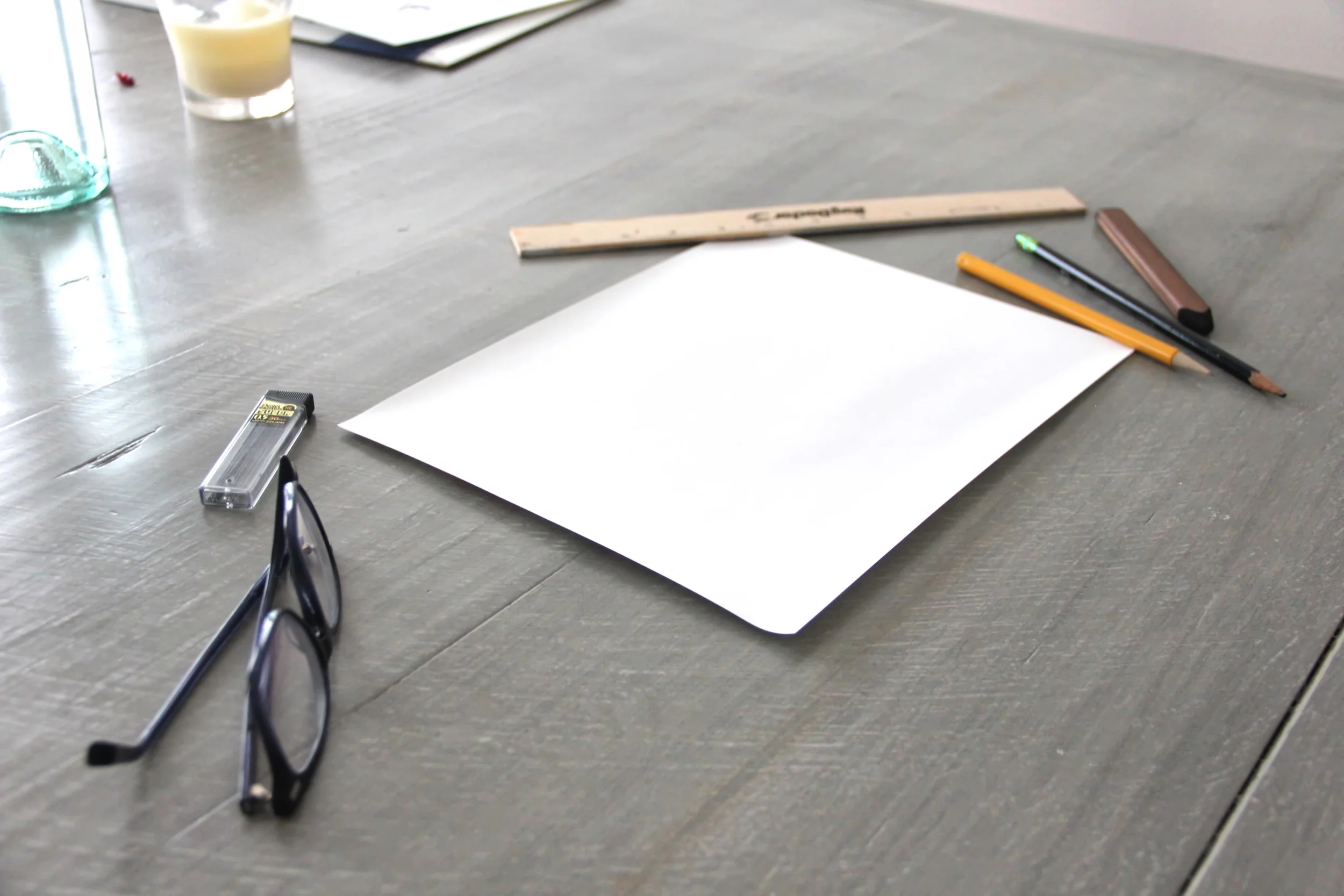
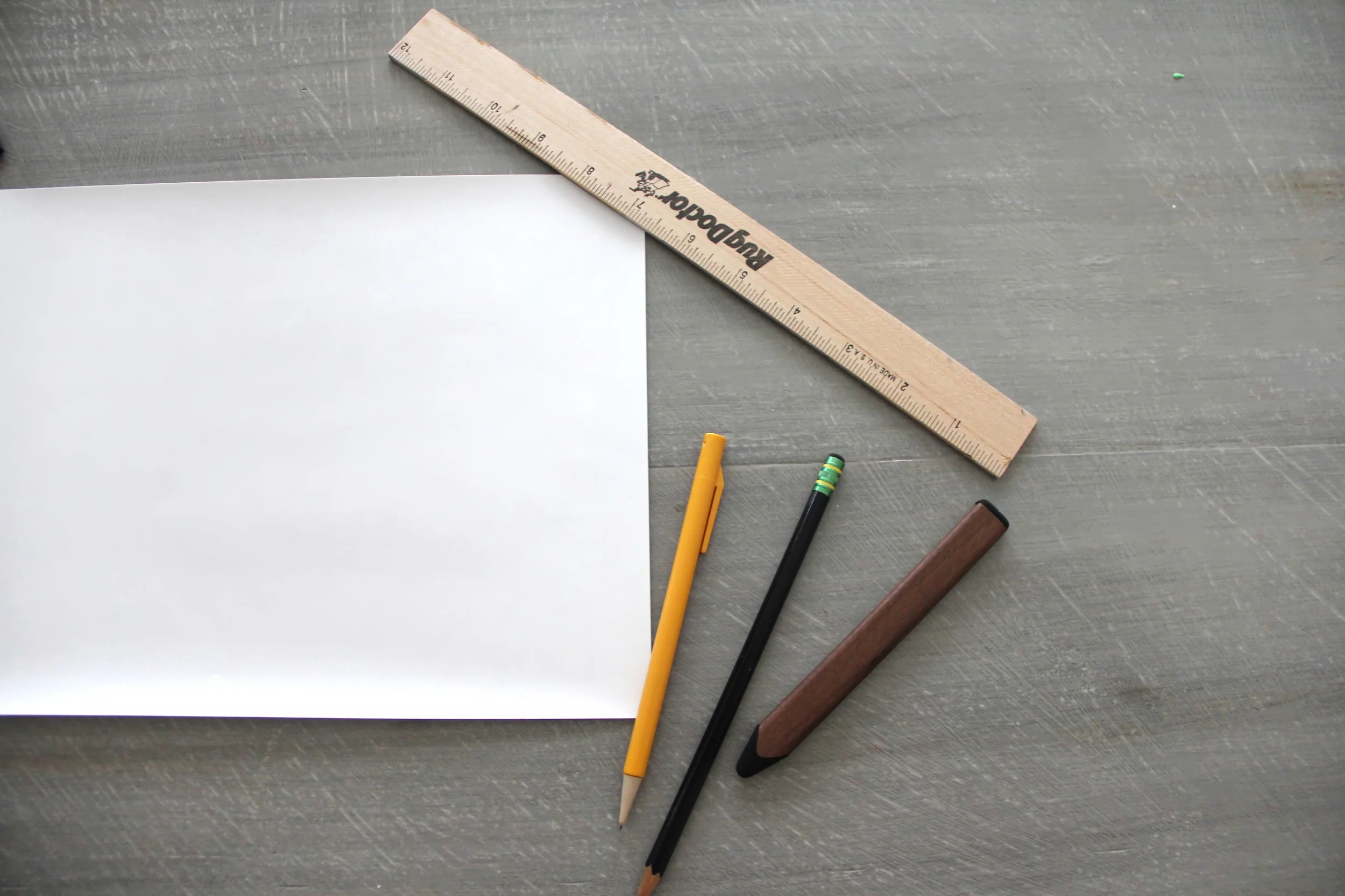
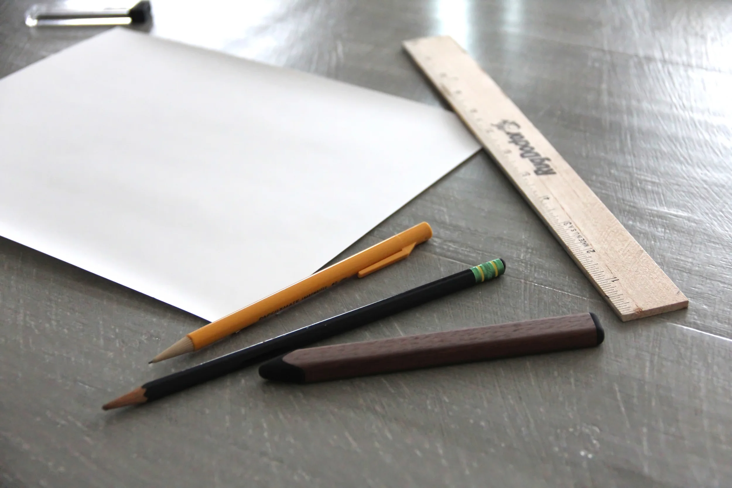
After we recorded the audio, I took photos of a blank piece of paper surrounded by pencils and a ruler neatly placed on my dining room table. The lighting from the morning sunlight diffused through the shades was perfect.
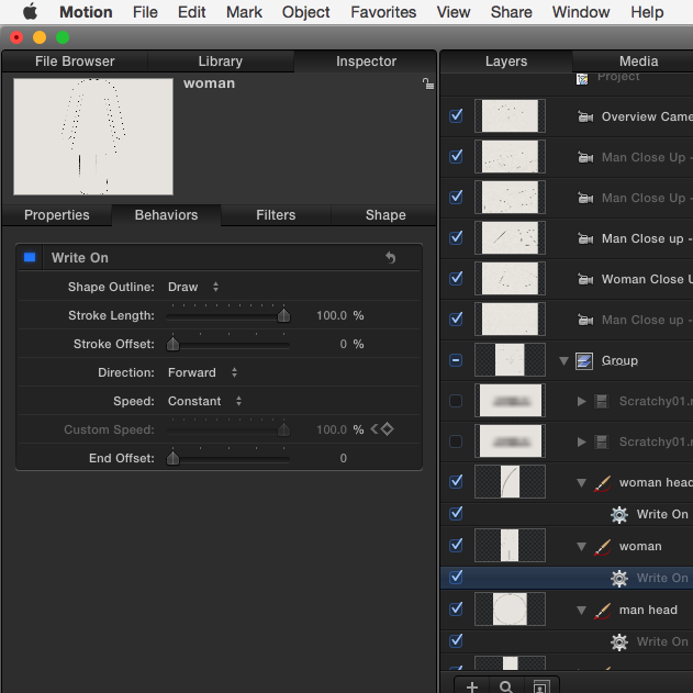
Next, I drew the stick figures in Apple Motion. If you watched the promo video, you'll notice some of the camera shots are extreme close ups. I really wanted to demonstrate the intricacy and thoughtfulness of God's design through these tight shots. But to execute them, the animation needed to be very high resolution. I used the Pencil Medium stroke preset in the shape's inspector window and applied a constant write-on behavior. But even at 4k resolution, there was a clearly visible limit to how close I could take the camera to the action. The second shot of the promo is the closest I could go without losing the HD resolution.
Next, I staggered when the shapes begin in the timeline over the course of about 45 seconds. I added a massive image of actual paper behind the shapes to give it texture, and then began to add in the virtual cameras. There were 5 cameras for each person (the man and woman) that needed to be moved, rotated, and carefully focused.
This is where the project became very slow. I use a quad core Mac Pro with two graphic cards, and it was slow, even with the depth-of-field turned off. Each of the cameras required about an hour to render, so if you're counting, that's 10 hours just in rendering these close up shots.
The next part wasn't so bad. I rendered a version of the animation with a transparent background and a head-on camera. Then, in another Motion project, I overlaid this animation on top of those photographs of the table. I simply placed the drawings on the paper with the distort tool. Now things were speeding up. These shots rendered at about 2 minutes each. Way faster.
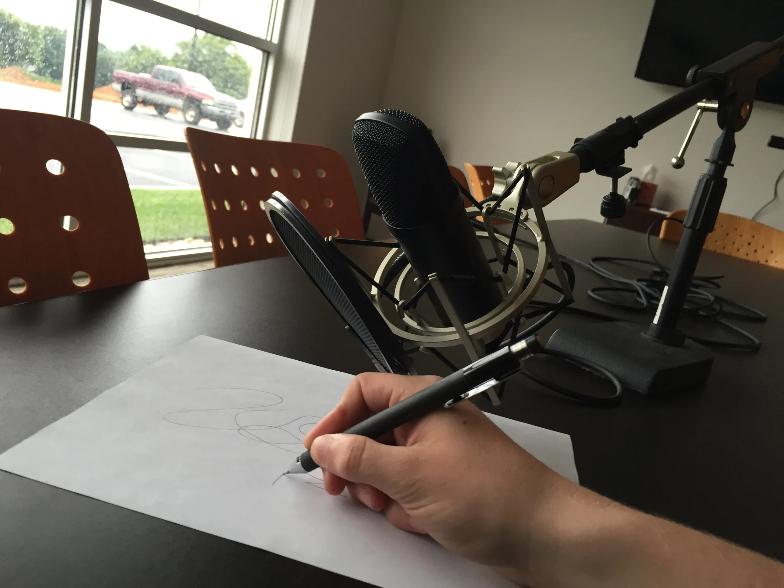
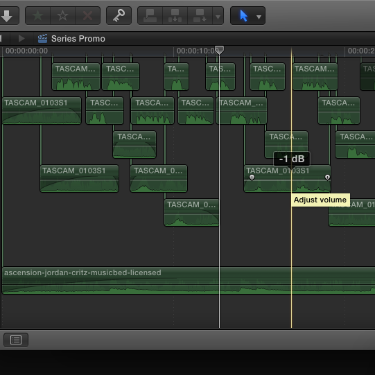
The final step was to edit all these shots together, along with the audio, in Final Cut. I recorded the sound of drawing with a pencil on paper, mixed the audio, did a little color correction, and the video was finished.
Overall, I was really happy with the way this turned out. It was the kind of animation I had wanted to do for a while - and although rendering took forever, it was a fairly simple one to make.
Enjoy!


