Sermon Series - On Repeat
Final Logo
In June of 2015, our church will begin a series entitled, "On Repeat." The series will focus on the lessons God has taught our lead pastor in the 20 years he's been a Christian.
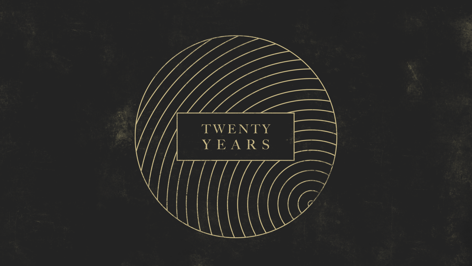
Since this is a series about our pastor, albeit indirectly, I wanted to reflect his style and personality in the series logo. He is really into the "hipster look" - a style I generalize in simple shapes, dark backgrounds, muted colors, thin lines, and ironically out of culture typography. The series was originally called, "20 years", so I asked the question, "How do I visualize 20 years in a symbol?" I came up with a list of things to show the passage of time:
- Orbits around the sun
- Spinning Earth
- Sand in an hourglass
- Clock with years instead of hours
- Rings on a tree
- Old yearbook/scrapbook photos
- Songs on a playlist
Original Logo
This was the design I ended up with - a symbol to encase many of the ideas in my list. I made it thinking of 20 rings on a tree (as that was my favorite and most hipster, probably), but framed the rings in another circle, as if you're observing the rings under a microscope. I showed the design to a few people and without prompting them, asked what they thought the design was. Some people saw a sphere or earth. Some people saw ripples in water. Others saw planetary orbits. And a few saw rings on a tree.
When we renamed the series to "On Repeat", I changed the style to reflect the more modern name. It's still "trendy hipster", perhaps, but less my personal taste than the original. With the new name, now people saw broadcast airwaves or grooves on a vinyl record. All of which, I feel, capture both the name and the message of the series.


