8 Simple and Free Ways to Improve Your Church Website
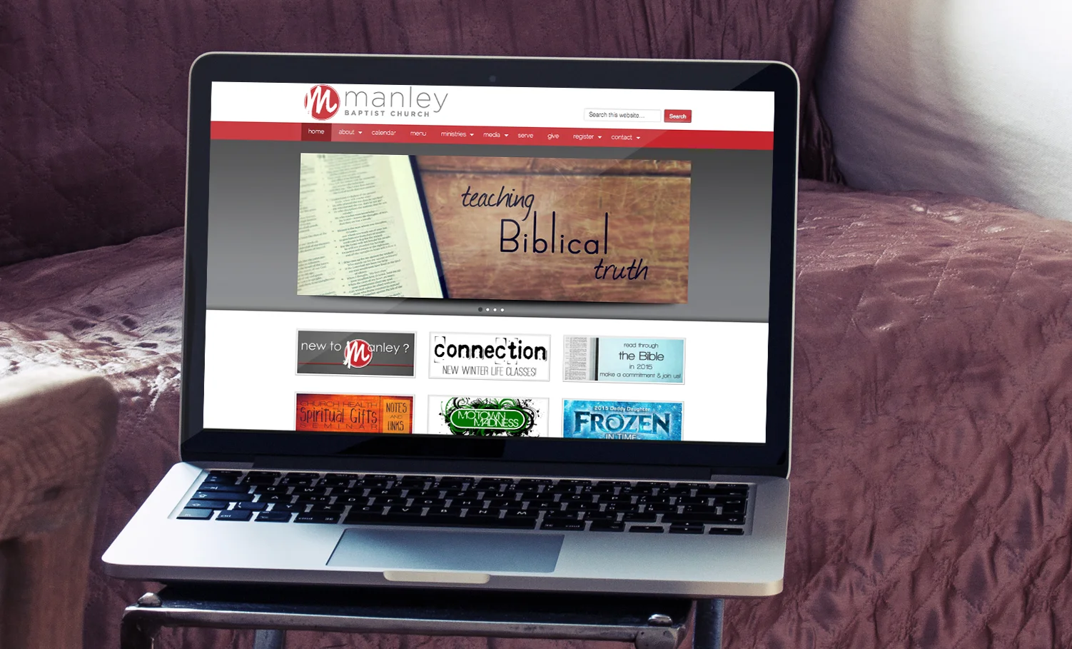
So you have (or are building) a church website and you want to make sure it's as visually appealing and communicatively effective as possible. Here are 8 simple ways to improve your church website for little or no cost to you. On each of these tips, I've included a photo of a church website within East Tennessee that I think executes that point really well. Give them a look!
1. DEVELOP A STRATEGY
In 2013, the average American adult spent 5 hours a day on the internet (eMarketer). That's a pretty good reason to have an effective website! So what do you want your website to accomplish? Write out the specific outcomes you're shooting for - both measurable and immeasurable. Use this written list to guide the entire process.
You're going to need to know your audience, too. Google Analytics is a phenomenal and free tool to show you who is using your website- whether they've been to your site before, what content they interacted with, which pages they browsed (and for how long), how they arrived at your website, and so on. Use this information heavily to get to know what your audience seems to want.
Some of our website goals:
Focus navigation and language toward unchurched people
Only use photos taken by Arrowhead staff and volunteers
Update content daily
Post sermons within 24 hours
2. Design Little, Update Frequently
It's important to keep in mind the reasons that people visit your website in the first place. They are looking for content - maybe information, a sense of what your church is like, video or audio resources - they're not looking for design. Keep the design out of the way.
A study by LifeWay found that almost half of church websites are updated once a month or less. However, a healthy update schedule for churches is at least once a week. Make sure all events, all text content, all promos, all sermons, and all photos are up to date. Some of those things you can probably get away with updating once a year (say a pastor's bio, for instance), but your homepage and online resources page should almost always be updated week to week. If you want people to come back to your site more than once, keep it updated.
How often do you update your website?
3. USE YOUR OWN PHOTOS, AND LOTS OF THEM
A photograph can say far more than text (Probably more than 1,000 words, too).
Stay away from stock images. Show what your church is actually like - not the building, but the people. Capture what visitors can expect from Sunday mornings, the energy of your student ministry, the fun of your kids' programming, or the importance of prayer in your congregation. The more candid, the more authentic, the better you've communicated what your church is actually like to an outsider.
You don't need a professional photographer either - you can honestly use just a decent smartphone and a $0.99 photo editing app. Whatever you use, remember, the camera flash can make the photo look amateur- turn the flash off, stay in fairly well-lit spaces, and you'll capture some nice photos.
The more photos you can use of people from your church, the better. A good goal would be for every page on your website to have one relevant picture. And again, keep them up to date!


Here are some photos from Arrowhead that captured real moments that we used on our website.
4. GET YOUR SERMONS ONLINE
If you've never posted your sermons online before, it's time to start. This might cost you a few hundred dollars if you don't have a recording device, but it allows people from all over the world (and more importantly, from your community) to hear the teaching your church provides on Sunday mornings. Once you have the recording equipment and a person committed to posting the sermon, here are a few resources to get it online:
Facebook Video - it's free and most 30+ year olds in your church are on Facebook. Keep in mind, millennials are leaving Facebook by the thousands every day, so expect a mostly adult audience.
Vimeo Plus - $60 a year and the best video hosting service for churches, in my opinion. No ads, customizable, and for almost everyone, you'll be able to embed your sermon from Vimeo to your church website/social media networks.
YouTube - it's free and the de facto video hosting service of our day. It's really great at getting people to your video who might be interested, but there are ads (and you have no control over which ones play).
Podomatic - it's a free (and upgradable) podcasting solution for audio recording of your sermons. Once you've made your podcast here, you can add it to the iTunes Podcast store where just under a billion people can find it and listen on the go.
Recording Equipment (on a budget)
If you're on a tight budget but you want to start recording sermons, about $300 should get you what you need. This Canon VIXIA is a great camera to get started. You'll need a tripod and a 32GB SD card, as well as a relatively new computer to edit and publish. Contact me with any questions you might have!
5. Talk About Sunday Mornings
More than likely, about half of the people who visit your church website have never visited your church before. Tell them (and show them, see point 3) about what Sunday mornings are like. Might someone feel under or over dressed? Is there Sunday school? Do you have something for kids? Those are the kind of Sunday morning details that will help put visitors at ease.
Personal Preference: I don't write about what I would consider to be points of unnecessary disagreement between church going people, such as the music style of worship.
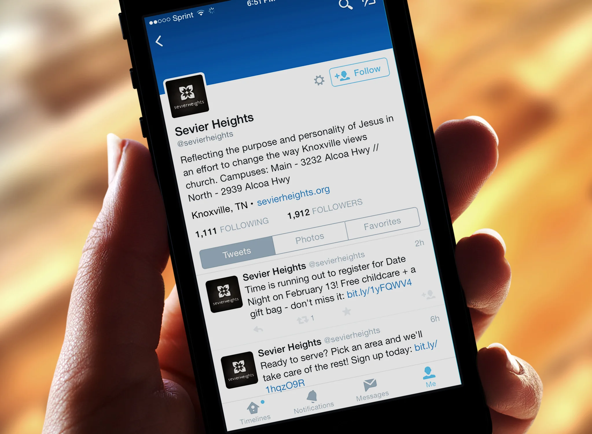
6. Care About Social Media
I did some research. In my area, about 1 in 20 churches had a Facebook page or Twitter account. Social media networks like Facebook, Twitter, Instagram, and others, are how most adults spend those 5 hours a day online - and these social networks present a huge opportunity for churches to stay connected with people throughout the week. In 2014, 74% of adults in the US were on social media networks (Pew). Rich, poor, young, old, rural or urban, the numbers remain pretty constant at 74%.
Use social media to direct followers to content on your website all the time. Post a new sermon? Tweet about it. Did the pastor write a new blog post? Facebook it. Did you kids' ministry build a cool new playset? Pin it. Are your students serving at a homeless shelter? Instagram it. Social media should be the active and personal incarnation of your church website; the two should be partnered. This is a daily responsibility, but it can take less than 5 minutes of your day and will be really worth it.
7. Use Consistent Branding
People recognized logos, colors, and images really well. Just ensure that whether in print, signage, or video, people can recognize your church and its events. It can be confusing if the church website has a different logo than the sign, for example. Or if your church is in a beautiful 200 year old chapel, but your website looks like '90s grunge, a visitor may feel they're at the wrong website.
8. Communicate clearly, not cleverly
Ministry names can be fun, but use them sparingly on your website. Remember most people are new, so choose clarity over creativity. For example, even though our student ministry is called "Fuse", on our website, you'll find the page is labeled "Students."
Think about the particular words you chose to use on your website - would an outsider understand what you meant? Insider language is really easy to write, but carefully avoid using terms that are unique to your church (or even to American Christianity).


