The New Caffeinated Fortitude
A year ago today, I launched this blog to share a bit of my passion for creativity and my journey in making things. It took me most of 2013 to come up with a website design that I actually liked, and of course it only took me 8 months to completely hate it. Today, I have (semi) finished the next step in the evolution my personal website.
A NEW PLATFORM
For years, I've been a Wordpress fanatic. Caffeinated Fortitude was built on Wordpress 4 and nothing in me doubted the supremacy of Wordpress (that sounds a little dramatic, but really). No longer. Today, Caffeinated Fortitude runs on SquareSpace.
In the (years) past, I found that SquareSpace was easy to use, but a little expensive and a bit limited in its function. In the process of rebuilding the Arrowhead Church website, I gave SquareSpace another try and was blown away. It's still easy to use, but the price is extremely reasonable ($8 a month for unlimited hosting), the premade templates are beautiful, the flexibility in the design is nearly limitless, and it is actually really powerful.
Two major issues I've had with Wordpress are speed and security. Wordpress is a processor-hog, so even the best hosting options pull up websites a little slow. Caffeinated Fortitude is filled with pictures, custom typefaces, and videos - plus all the plugins I had to use in Wordpress to create the experience I wanted - and it was slow. The other issue I've had with Wordpress for years has been the rampant security breaches. In fact, the Arrowhead Church website of 2012, a Wordpress site, was brought to its knees by a major hack. Wordpress is the Microsoft Windows of the internet - a massive target with so many plugin and extension options that it is a prime victim of cyber criminals. Almost all of my Wordpress sites (from 5 different hosts) have been attacked and damaged, no matter what precautions I took. Sure, you can restore from backups, but in my experience, those can be corrupted weeks before you ever realize there's a problem. Not fun.
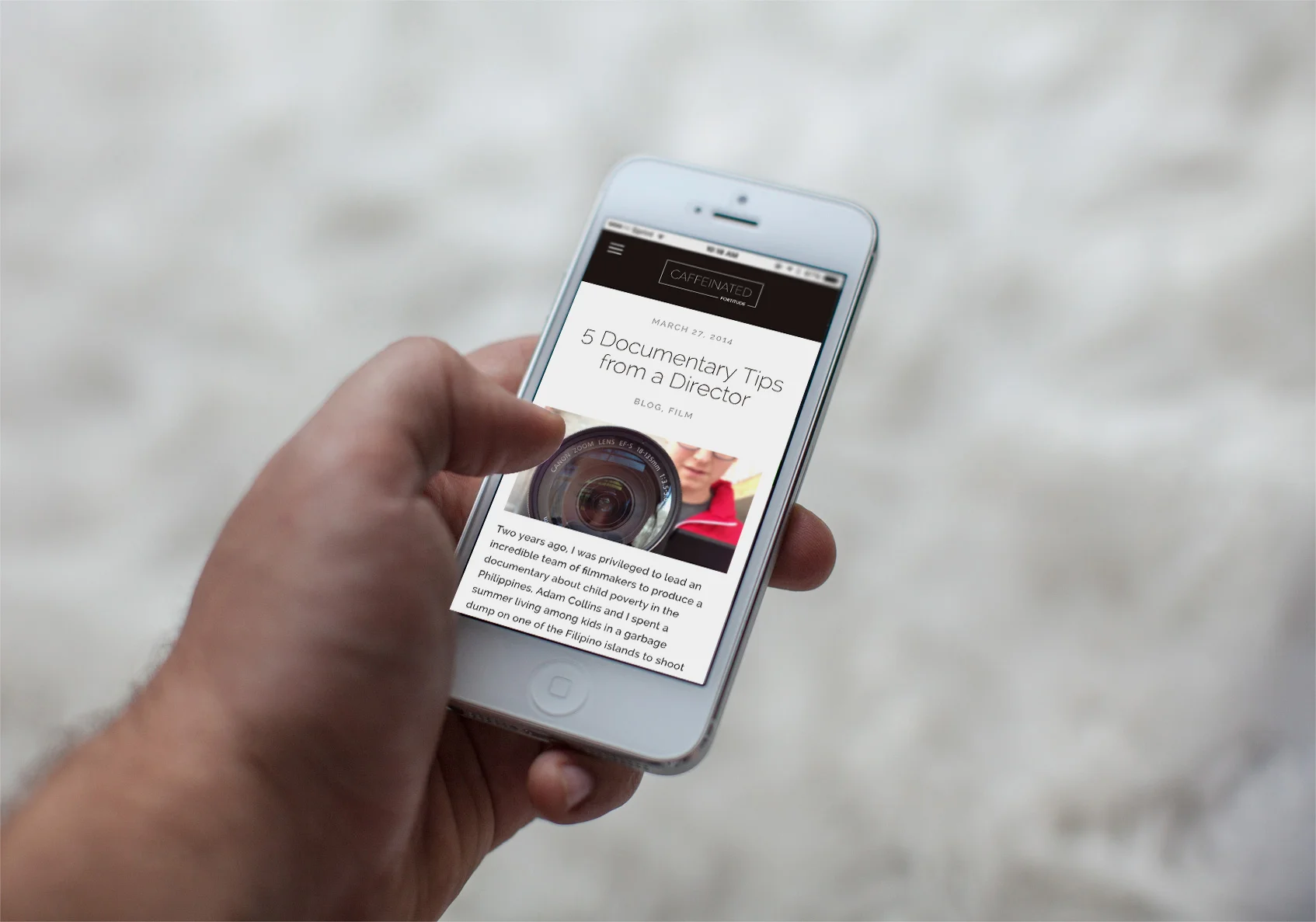
All SquareSpace sites have responsive designs built in, so they look great on computers, tablets, and phones alike
SquareSpace, by contrast, functions in a similar way to Apple, with really alike pros and cons. Everything is made and updated by SquareSpace, so security vulnerabilities are significantly reduced. The hardware and software are optimized for each other from the server side, so the sites load quickly and smoothly.
In terms of function, I've found SquareSpace is loaded with options. Whether text, images, videos, music, buttons, products for sale, galleries, forms, menus, maps, calendars, blogs, podcasts, social media, commenting, or charitable donations - it is all built in. What isn't built in can be added in many cases through HTML blocks or custom CSS. But what isn't available to you in those options is pretty much off the table.
I am impressed by SquareSpace. No question. It isn't quite as versatile as Wordpress, but for just about everyone, I would say it is the best option by far. I have loved it.
A New Design
The old Caffeinated Fortitude site. Pretty good, but not exactly right.
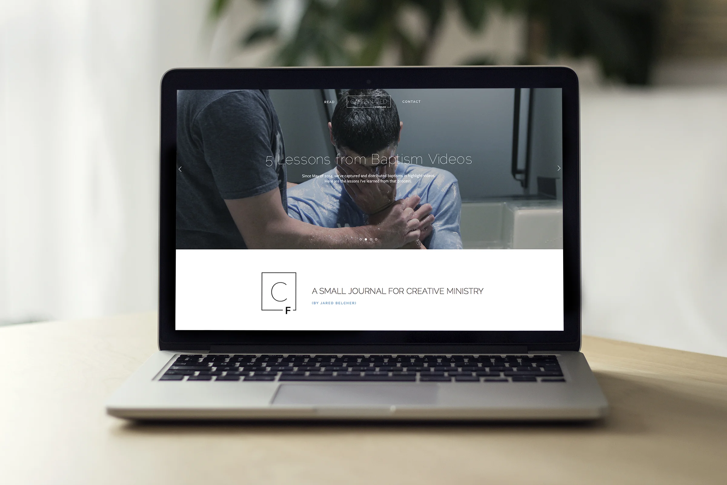
From the beginning of Caffeinated Fortitude, I wanted a website that would drive the focus to the blog content (text, images, and video). Since I have no interest in making money from advertising, my goal is to make this blog as distraction-free as possible. White space on the sides, bold titles, narrow images, and a simple navigation. If a reader is on an article, that's all I wanted to be on the page. Not an easy thing to build on Wordpress, actually.
The design of this new website is so much better for distraction-free reading. I get to carefully craft how a reader experiences each page. So there is nothing except the text and images of a single blog post. Perfect.
A New Font
The header font is now Raleway in all caps. Raleway is an open-type font distributed by The League of Moveable Type. Designed in 2012 specifically for modern devices and web experience, it's "an elegant sans-serif typeface that features both old style and lining numerals, standard and discretionary ligatures, a pretty complete set of diacritics inspire by more geometric sans-serif typefaces than it's neo-grotesque inspired default character set". It bridges my love for thin, bold modern type with my affinity for American Modernism. The perfect header.
The body font of this site is now Freight Sans Pro, one of the best selling typefaces of Phil's Fonts. Designed for warm formality in text and an authoritative, helpful tone in display, Freight Sans eschews mannerisms of form in favor of a studied balance of organic and geometric shapes. Pleasant on the eyes, carefully tracked, and a perfect companion to Raleway.
A New Logo
The old Caffeinated Fortitude Logo
For a year, the Caffeinated Fortitude logo has been a simplified caffeine molecule. I haven't loved it, since it only plays on half of the name and very little of the meaning behind the name. So I figured hey, a new website is a great time for a new logo, right? Why not.
The new logo plays more on the attributes of the name itself. Thin lines with sharp angles surround the energy of the word caffeine, locked and held in order by fortitude at the foundation. Energy and restraint. Creativity and formulaic process.


