Behind the Arrowhead Church Logo
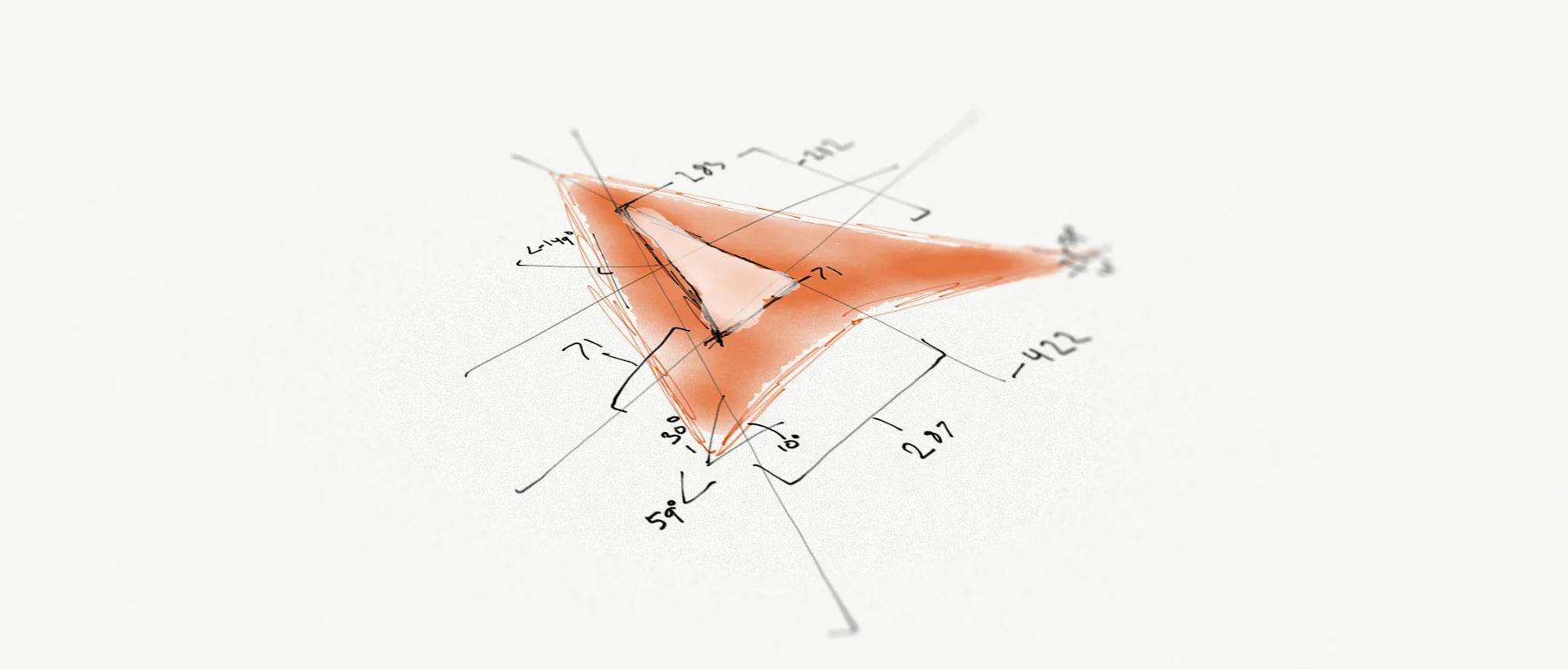
When I was hired by Arrowhead Church as a freelancer back in 2011, Ben (the lead pastor) asked me to begin to consider a redesign of the triangular logo. Over 6 years, the logo has gone through 3 major evolutions, without ever significantly changing from the original.
Waaaay Back in 2009...
When the church launched in 2009, the logo wasn't far from what it is today. A major difference was that the original designer, a friend of Ben's in Knoxville, gave it a hint of dimension by coloring the bottom separately from the top and moderately distressing it for a "grunge" look.
Almost immediately, the church printed these car stickers to hand out to anyone who visited. Long before I ever attended Arrowhead, I remember seeing these stickers on the back of cars all over town.
But a major problem with the distressed element of this logo was that the effect was extremely low resolution. If you tried to print the logo any bigger than a few inches, say to put on a billboard for example, those small white specs became these huge, awkward holes in the symbol. To fix this problem, Ben had the logo cleaned up a bit.
The 2011 Clean Up
The 2011 logo is the version most people are still familiar with (since thousands of stickers with this logo still proliferate the area and it is so close to the current version). The wordmark "Arrowhead Church" had a new set font and placement, which was a clean, san serif departure from the original Clarendon-style font you see on the car sticker above. The 2011 version was a great modification by an Arrowhead staff member in the direction of minimalist taste.
When Ben asked me to change the logo on my first day at work in 2011, I actually really liked the current logo and tried to convince him not to change it. He did agree, but still wanted to see it further simplified eventually, perhaps as much as just an equilateral triangle.
Then in 2013...
In early 2013, I found a totally revamped logo concept laying on my desk. Ben had hired a nation-wide design firm to draw up a new logo for us, but the staff found all their concepts to be frustratingly terrible. This letter A in a circle was an idea Ben had after the disappointment with the firm. It was simply the letter A in Ribbon type surrounded by a circle. Personally, I liked our other logo better, and after Ben and I discussed it, he gave me an option: design a (better) new logo or we were going with the A-circle idea. So immediately I got to work.
Click to see the full original proposal
I spent a week in my office working on 20 different logos. I wish I still had them but as far as I know, they're all lost. I remember feeling so frustrated after days of hard work, feeling like none of them were really any good. I left the project annoyed and defeated, but when I returned to the mockup sheet two weeks later, I found one I really liked. It was Logo number 4. It was exactly what I wanted. It reduced the number of triangles from 7 to 3, was nearly equilateral, and still perfectly distilled the name of the church into a single mark. I drew up a proposal and on May 20, I emailed it to Sabrina (Ben's assistant).
An hour later, I got a response.
"Our efforts have paid off :)"
After a family meeting, all the staff expressed their preference for "logo-4" over the "A-Circle." Ben agreed to this new logo for several years after we moved into our building. Ben and Sabrina selected the new, official Arrowhead orange and the typefaces for the new wordmark. I took their selection and drew up our first style guide in the summer of 2013 (read more about our current style guide here).
Since mid-2013, we've made very few departures from this design. Occasionally we use a ringed circle or no circle at all. But for the most part, logo-4 has remained intact.
2015 and Beyond
We plan on using this logo for several years to come. I suspect that Ben would like to see the logo further simplified in the future and perhaps eventually encapsulate more of what we're about than what we're named - but for now, this is our identifying mark. It may seem like a lot of work over a logo, but people have come to embrace this small symbol as a declaration of their church family - an icon that for many people in our area, simply means home. As we move forward, it will likely evolve further. But not without a great deal of thought, care, and passion.


